5th Grade:
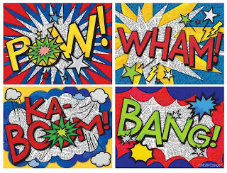
Yoshimi has battled the Pink Robots and her "ninja skillz" have paid off! Objectives for this project included demonstrating knowledge of various types of balance, experimenting with lettering, figure proportions, and interpreting inspiration in a unique way. Here are some of the finished works:
4th Grade: I can't post a photo of the examples from the Warhol project here, since they include actual photos of the students. But I'll do my best to describe what they did. I took a photo of each kid standing in front of a white background. Then I uploaded the pictures and bumped up the contrast and converted them all to black and white. This project was all about CONTRAST! I printed the photos out, two of the same picture on each page, and gave them to the kids. They chose complementary colors from my treasure trove of Mr. Sketch markers. (I recently acquired the 18 color packs which have tints of many of the colors.! :D )
They colored over their pictures, one in each complementary color. Then they cut out their faces and bodies from the background, and glued them to another paper, which was already colored in the same complementary pair. Finally, using darker values of the same two colors, they added Pop Art style lettering, and Ben Day Dots to the backgrounds. So this was really more of a Lichtenstein/Warhol inspiration than just Warhol alone. Anyhow they turned out pretty neat, and for a quick marker project, I was happy! Lesson objectives included: analyzing color and contrast by choosing complements, and identifying and organizing colors by value. I figure you could also do this in primary colors, and teach a little about color mixing and Value...
3rd Grade: Inspired by the Oaxaca Folk Art carvings of animals, we set out to compare organic and geometric shapes, and create patterns using shapes. I had the kids find an image of an animal they liked, and draw it large on a white piece of paper. Then, using thin-tipped markers (Mr. Sketch, of course!) they created patterns using EITHER organic OR geometric shapes. I made sure I had them choose only one or the other, and stick to that theme, so that I could tell they could compare the shapes. For this project I deliberately asked them not to draw any kind of background. I think they are much more interesting without a fake "habitat" for the animals.
I've been impressed with this grade level so far. I have one student who is so dedicated to finishing this project that she has come in EVERY DAY during recess the past week or so to work on it. And we are having gorgeous weather. I'm not talking about rainy days here. This is the same group of kids I did Chihuly with last year, and they are just a super-creative group, with very sweet personalities and a lot of good character.
2nd Grade: The Keith Haring-Inspired line designs with movement are beautiful as I knew they would be. Kids love Sharpies. Heck, I LOVE SHARPIES. When I told the kids we were going to have a fundraiser their response was, "So we can buy MORE SHARPIES!!?!?!?" Yeah, baby. So I posted the lesson for this Last Year, in September. But this year I pushed the movement aspect of it more, and the kids seemed to understand the amount of lines I was asking for. Objectives included: Creating pattern and movement using line, and being able to talk about Keith Haring.


I'm not an art teacher, but so enjoy getting your newsletter and seeing the wonderful projects. I'm wondering if it is too late to go back to elementary school :)
ReplyDeleteGreat artworks here. Love to see it!!!
ReplyDeleteEverything is different. Its nice art.
ReplyDelete------------------------------------------
Online Math Games