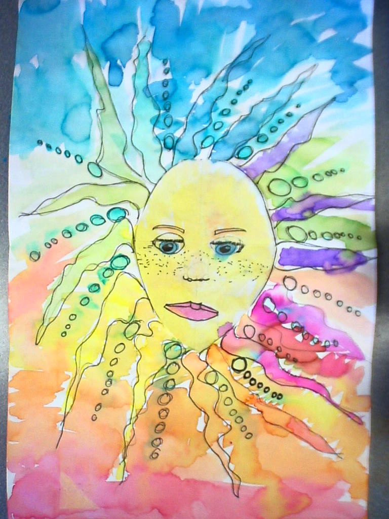
I do a lot of abstract art with the littles. They are better at making "lines, shapes, and colors" than they are at making realistic subjects.
So for our painting lesson, we looked at the work of Kandinsky and talked about Variety. We learned the sign language for Variety, Line, Shape, and Color, and we painted like super artists. This week we took the paintings and added even more variety by using skinny markers in the white spaces. I LOVE THE RESULTS:
Showing posts with label markers. Show all posts
Friday, January 20, 2012
Tuesday, October 11, 2011
Yoshimi Battle, Warhol Portraits, Oaxaca Animals, Keith Haring
Alright, the kiddos are finishing things now, and I am so excited about how this first round of big projects are turning out! I had a deadline for my upcoming fundraiser, and the work all has to be finished by Wednesday of next week...this fundraiser is a blog entry in itself...more later.
5th Grade:
Yoshimi has battled the Pink Robots and her "ninja skillz" have paid off! Objectives for this project included demonstrating knowledge of various types of balance, experimenting with lettering, figure proportions, and interpreting inspiration in a unique way. Here are some of the finished works:
5th Grade:
Yoshimi has battled the Pink Robots and her "ninja skillz" have paid off! Objectives for this project included demonstrating knowledge of various types of balance, experimenting with lettering, figure proportions, and interpreting inspiration in a unique way. Here are some of the finished works:
4th Grade: I can't post a photo of the examples from the Warhol project here, since they include actual photos of the students. But I'll do my best to describe what they did. I took a photo of each kid standing in front of a white background. Then I uploaded the pictures and bumped up the contrast and converted them all to black and white. This project was all about CONTRAST! I printed the photos out, two of the same picture on each page, and gave them to the kids. They chose complementary colors from my treasure trove of Mr. Sketch markers. (I recently acquired the 18 color packs which have tints of many of the colors.! :D )
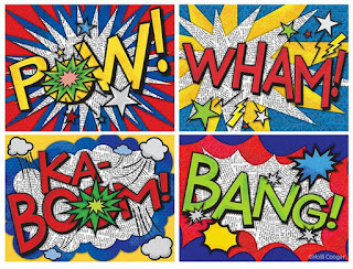
They colored over their pictures, one in each complementary color. Then they cut out their faces and bodies from the background, and glued them to another paper, which was already colored in the same complementary pair. Finally, using darker values of the same two colors, they added Pop Art style lettering, and Ben Day Dots to the backgrounds. So this was really more of a Lichtenstein/Warhol inspiration than just Warhol alone. Anyhow they turned out pretty neat, and for a quick marker project, I was happy! Lesson objectives included: analyzing color and contrast by choosing complements, and identifying and organizing colors by value. I figure you could also do this in primary colors, and teach a little about color mixing and Value...
3rd Grade: Inspired by the Oaxaca Folk Art carvings of animals, we set out to compare organic and geometric shapes, and create patterns using shapes. I had the kids find an image of an animal they liked, and draw it large on a white piece of paper. Then, using thin-tipped markers (Mr. Sketch, of course!) they created patterns using EITHER organic OR geometric shapes. I made sure I had them choose only one or the other, and stick to that theme, so that I could tell they could compare the shapes. For this project I deliberately asked them not to draw any kind of background. I think they are much more interesting without a fake "habitat" for the animals.
I've been impressed with this grade level so far. I have one student who is so dedicated to finishing this project that she has come in EVERY DAY during recess the past week or so to work on it. And we are having gorgeous weather. I'm not talking about rainy days here. This is the same group of kids I did Chihuly with last year, and they are just a super-creative group, with very sweet personalities and a lot of good character.
2nd Grade: The Keith Haring-Inspired line designs with movement are beautiful as I knew they would be. Kids love Sharpies. Heck, I LOVE SHARPIES. When I told the kids we were going to have a fundraiser their response was, "So we can buy MORE SHARPIES!!?!?!?" Yeah, baby. So I posted the lesson for this Last Year, in September. But this year I pushed the movement aspect of it more, and the kids seemed to understand the amount of lines I was asking for. Objectives included: Creating pattern and movement using line, and being able to talk about Keith Haring.
Labels:
2nd grade,
3rd grade,
4th grade,
5th grade,
comics,
complementary colors,
keith haring,
lichtenstein,
line,
markers,
movement,
mr. sketch,
pattern,
proportion,
radial balance,
sharpie,
warhol
Wednesday, October 5, 2011
Monochromatic Collages
I showed slides of Mark Rothko (not one of my favorite artists, but the kids really responded well to the idea of color invoking mood.) After a lesson on value, tints, shades, and all that, the kids chose one piece of construction paper. This would be their HUE.
Then they simply cut things from magazines that were in different values of that same hue. Finally I had them cut letters out (ransom note style) and add them to their collage, making a sentence that pertained somehow to the mood of their artwork. These turned out even better the next year when I ran out of construction paper, and instead gave the kids a half sheet of regular drawing paper and instructed them to color it entirely one hue, using the MR. SKETCH scented markers. This not only made the kids ecstatic, but it also filled my classroom with a lovely fruity aroma. I am a believer in aromatherapy, just as a side note. And it may sound hokey but I really think scent has an effect on mood as well. This was something I didn't think to point out to the kiddos at the time, but it would tie in well with Rothko.
After they all finished gluing, I had them coat their collages with watered-down elmer's glue. The year that we started with white drawing paper and markers, the final glue coat liquified the marker a little bit, resulting in an all over subtle color wash. Neither I nor the kids were expecting this, and they were overjoyed. They were tinting their collages themselves. What a nice surprise! This also made the work feel more handmade, as the construction paper backgrounds tended to look a little flat.
Friday, September 30, 2011
Yoshimi Battles the Pink Robots
This year with 5th grade, I've tried what I consider to be a bold, outside-the-box project. Prompted by a student's request that we do a project related to manga, and our Asian art theme, and the new Mr. Sketch markers, I thought about how I could tie all that together.
Years ago when I was teaching K-8 at a small Catholic school, I tried this on the first day of my Art Appreciation class with the middle schoolers. I turned on the Flaming Lips' Yoshimi Battles the Pink Robots, Parts 1 and 2 and asked them to sketch whatever images came to mind as they listened to the music. They thought I was from another planet. They were used to nuns and opera music in the art room. Robots were unheard of. But their images were interesting. I think they were held back mostly by the fact that they were middle school kids, and thus more concerned with looking cool than with being creative.
This year's 5th graders are diving into this project with uncanny enthusiasm. Maybe it's because I told them a fellow student gave me this idea, or maybe it's the musical element, or the smelly markers. The objectives for this lesson included drawing body proportions of the girl Yoshimi, face proportions, choosing a type of balance to use (i.e. radial or asymmetrical) and experimenting with comic style lettering. So far they are enjoying it. I'll have to post some examples when they finish.
At least for now, they are all singing, "Oh Yoshimi, they don't believe me, but you won't let those robots eat me..."
Years ago when I was teaching K-8 at a small Catholic school, I tried this on the first day of my Art Appreciation class with the middle schoolers. I turned on the Flaming Lips' Yoshimi Battles the Pink Robots, Parts 1 and 2 and asked them to sketch whatever images came to mind as they listened to the music. They thought I was from another planet. They were used to nuns and opera music in the art room. Robots were unheard of. But their images were interesting. I think they were held back mostly by the fact that they were middle school kids, and thus more concerned with looking cool than with being creative.
This year's 5th graders are diving into this project with uncanny enthusiasm. Maybe it's because I told them a fellow student gave me this idea, or maybe it's the musical element, or the smelly markers. The objectives for this lesson included drawing body proportions of the girl Yoshimi, face proportions, choosing a type of balance to use (i.e. radial or asymmetrical) and experimenting with comic style lettering. So far they are enjoying it. I'll have to post some examples when they finish.
At least for now, they are all singing, "Oh Yoshimi, they don't believe me, but you won't let those robots eat me..."
Tuesday, September 20, 2011
Marker Monster
I even let the Monster eat Sharpies, because they too can be revitalized using NAIL POLISH REMOVER. Yes! It works! Just soak the tip in a little bit of the nail polish remover and recap the sharpie. Overnight, the liquid refreshes the ink!
So far they are in love with the Marker Monster. I love his crazy teeth, which are now splattered with various marker smudges. It's a little macabre I suppose, but oh well.
Wednesday, February 2, 2011
Free Liquid Watercolors!
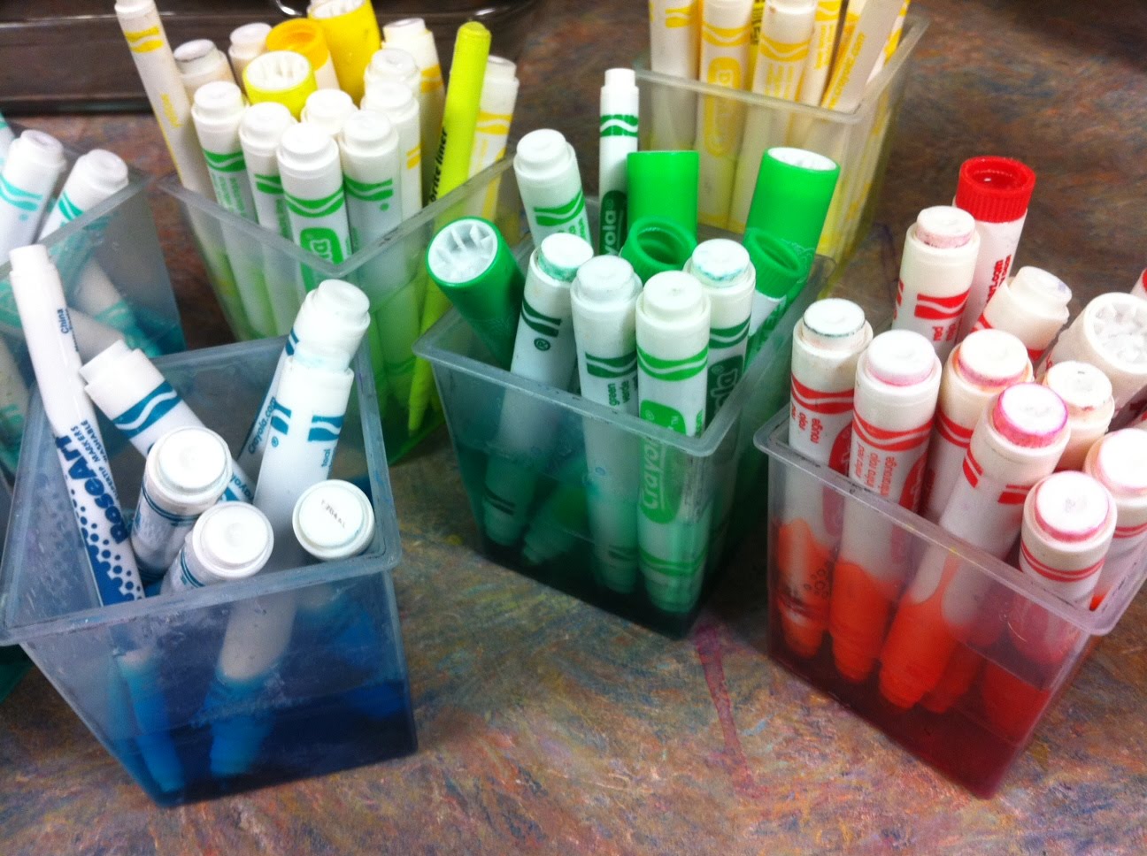
Don't you love free stuff? Of course you do! It's part of your teacher chromosome! ;) I thought I would share this technique because it is essentially free, and it's working so well for me. I heard about this from Debi West, a fabulous superwoman art teacher from Georgia. She suggested making liquid watercolors from "dried out" markers. All you have to do is take the lids off the markers and soak the tips in water. It took me a bit of experimenting to perfect the ratio of ink to water. I found that it worked best filling these square cups to the line and then putting in as many markers of one color as I could. The watercolor paint can be diluted more if you want a pastel look, but I prefer the color be as bright as possible. I then pour the colors into seperate larger bottles for storage. (****UPDATE: If you have a pair of pliers, you can actually take the marker apart and remove the foamy ink reservoir, then put just THAT into the water. That works even better, I've found!****)
One thing to be aware of is that the paint in the bigger bottles can get a little smelly every once in a while, just like tempera paint. I usually fix that problem by squirting a significant amount of Germ-x into the paint, and shaking it up. Maybe that isn't the best way but it works for me. In my opinion, this is a minor problem considering that this stuff is free, easy to obtain, and the resulting paintings are beautiful. The projects you could do with liquid watercolors are infinite.
Subscribe to:
Posts (Atom)