Showing posts with label value. Show all posts

Tuesday, February 14, 2012

Broken Projector. Op Art!

So I'm spoiled.  I have a lovely projector in my classroom, a document camera, AND a Promethean board.  So whining about how my projector is on the fritz right now is not really very productive.  I must say though, that in the absence of the projector I've encorporated several new projects I wouldn't have done if I'd been able to move forward with my curriculum the way I'd planned.  Right now, 5th grade is working on Op Art.  I tried this with the same group of kids when they were in 3rd grade and they did fairly well with that version of the project, which was basically an ink blot, with "echo" lines around it, or if you speak Zentangle, we'll call them "auras."

Here's the version from two years ago.  I included Color Field Painting in the inspiration.  Basically we used a blob of watercolor, and a straw to blow the blob into drippy shapes.

I needed a lesson that would review a lot of key terms and concepts, and introduce a new one, which didn't require a lot of demo and slides on my part.  And I noticed as the next class came in, I didn't feel like demonstrating the exact same style of Op art.  So I mixed it up with three different projects, all having simliar objectives: to demonstrate Value, Movement/Rhythm, Pattern, and (illusion of) Form.


Here are the three different examples I ended up with.  So far the kiddos are into it, since it takes far less brain power than the previous block printing project.

Monday, January 30, 2012

Finished Celtic Knots


After trying this with a few classes, I don't know why it never occurred to me to have them draw on colored paper, using the black and white charcoal.  I did that for my second example, (above) and it turned out much better.  But still, they are able to do the project with minimal whining.  I've found it's important to give them only the soft charcoal pencils and not the hard ones, since the hard ones obviously don't make as dark of a mark.


But here are a couple of the first few to be finished.  The later classes have drawn them on construction paper.  I found the construction paper, being more fibrous, I guess, took the charcoal better and added more contrast to the shaded parts.  But the white ones are very nice as well.  I found I really had to get the kids to think SIMPLE!  I coached them through drawing the center of the design, and then let them finish it however they liked.  A lot of them wanted to go nuts with overlapping knotwork, which did not translate well when they tried to transfer it into the other sections.


This one was just simple enough, and she did great with the shading.  So there ya go,  Fourth Graders CAN do Celtic knotwork!  :)

Monday, December 12, 2011

Celtic Knots and Radial Balance

I wanted to spice up my Celtic Knot project that I've done several years in a row, because so far it just hasn't met my expectations.  Previously, I'd had the kiddos use their initials to make illuminated letters with Celtic imagery (which I'd photocopied from my Dover books and passed out in resource folders).  Most students just didn't really puzzle out how to draw the overlapping knots.  So I thought I'd make it easier by having them draw the knots with a Zentangle pattern.  Here are the steps for the pattern:


Original link here:  Tangle Patterns


So I showed them that step-by-step on the Elmo.  I expected a train wreck.  I told them this was an experiment, and I was going to see how they did before we even worried about turning this into a project or anything.  I expected tears, and crumpled papers flying across the room, hitting me in the head.  But, y'all....They did it!  They got the pattern in one or two tries.  Even the more challenged kids picked it up and were very satisfied to see that it worked for them!

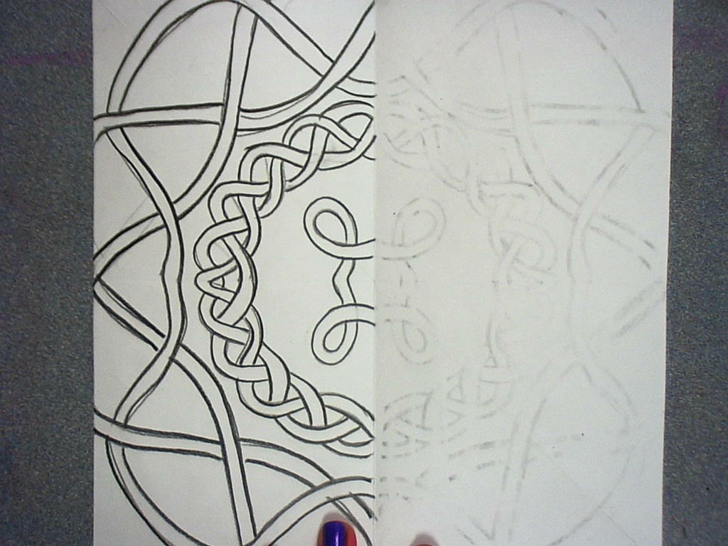
Then I started showing them my work in progress.  I told them I was going to have them draw 1/4 of a Celtic knot, and "cheat" to make the pattern transfer onto the other parts of the paper.  I haven't tried this with the kiddos yet, so I'll keep you updated on how that goes.  This would work even better if you are willing to let the kiddos use charcoal pencils to outline their knots as they are transferring.

But here's what I did for my example:

 Fold the square paper in fourths and draw design in one corner.  Trace over it hard with an ebony pencil or other soft lead pencil.


 Fold and press with your hands, or a wooden spoon to transfer the pencil lines onto the second quarter of the paper.


 Open and you should see a very faint reverse image of the knot you drew.  Trace over it dark with the soft pencil. 


 Fold and transder the first half onto the second half.  (Good way to review factions, too!)


 Trace over the pencil lines darker. 


Connect the lines where they may be slightly mismatched, and begin coloring however you wish.

I think I'll make another fancier one as I go along, but I think the above example works well as an illustration.  Our state's standardized test has evidently got symmetry on it, and the kids aren't scoring so well with that.  In that case, I can actually help!  I've been stressing symmetry with all the grade levels this year.

Wednesday, October 5, 2011

Monochromatic Collages

 So this is a project from ages ago, but I was recently organizing my iPhoto, and it appeared.  I was very happy with the way they look displayed.  Ah the good old days when I actually had time to hang up artwork in the halls!  Ha! 
I showed slides of Mark Rothko (not one of my favorite artists, but the kids really responded well to the idea of color invoking mood.)  After a lesson on value, tints, shades, and all that, the kids chose one piece of construction paper.  This would be their HUE.  

Then they simply cut things from magazines that were in different values of that same hue.  Finally I had them cut letters out (ransom note style) and add them to their collage, making a sentence that pertained somehow to the mood of their artwork.  These turned out even better the next year when I ran out of construction paper, and instead gave the kids a half sheet of regular drawing paper and instructed them to color it entirely one hue, using the MR. SKETCH scented markers.  This not only made the kids ecstatic, but it also filled my classroom with a lovely fruity aroma.  I am a believer in aromatherapy, just as a side note.  And it may sound hokey but I really think scent has an effect on mood as well.  This was something I didn't think to point out to the kiddos at the time, but it would tie in well with Rothko.

After they all finished gluing, I had them coat their collages with watered-down elmer's glue.  The year that we started with white drawing paper and markers, the final glue coat liquified the marker a little bit, resulting in an all over subtle color wash.  Neither I nor the kids were expecting this, and they were overjoyed.  They were tinting their collages themselves.  What a nice surprise!  This also made the work feel more handmade, as the construction paper backgrounds tended to look a little flat.  


Wednesday, March 30, 2011

An Old Standby with a Twist


Georgia O'Keefe flowers. We all do them. But this is the best result I've had, so I thought I'd share. Second graders are very creative and unafraid of drawing yet, so I had them draw their flowers from looking at silk ones I put at each table. I explained carefully about not drawing what they imagine they should see, but instead drawing what they ACTUALLY see. We call those ideas of what something is supposed to look like "Schema." As in, previously learned information.


So the drawings themselves were very interesting. I required the kids to use asymmetrical balance, and go off all four sides of the paper, leaving as little negative space as possible. After drawing with pencil, they traced over it in Sharpie.


Next I had them use tissue paper and diluted white glue to color the flowers, brushing over the tissue like a decoupage. Lastly, after this was finished and dried, I had them add value shading and color accents with chalk pastels. (We got lucky and happen to have a box of Prismacolor Nupastels for each table - a donation.) For many students, most of what they did was trace the sharpie lines with black chalk pastel, and then blend it with a paper towel. I was thoroughly thrilled with how they turned out, and how well the kids listened and learned to use a new medium.


After everyone was finished, I lined them up outside and sprayed the artworks with Aqua Net hairspray as a fixative. They LOVED that. I have no idea why, but that seemed like the coolest thing in the world to them!


If any of you readers have a different way of doing this project that you just love, share it with me! I also wonder how 2nd graders are doing for you at your school. Is it me, or are they all super sweet this year?

Thursday, November 18, 2010

The Dot


I was looking for a way to use value in a quick project for First grade after last week's fingerprint value scale turned out to be a success. Finally I remembered that I could adapt the Kindergarten lesson on Emphasis and kill two birds here.

I read one of my favorite books, The Dot, by Peter H. Reynolds, to my first grade students. They were especially interested in the character Vashti's painting in which she made a dot by "not painting a dot". I gave them a small piece of card stock and asked them to draw a dot with a pencil, then cut out the shape. They taped this dot onto a piece of paper and I had them paint the whole paper with one color of paint, plus black and white. They quickly discovered that they could change the value of the color by mixing. The tricky part was getting them not to turn the entire paper a nasty gray... But I solved that by asking them to keep the black and white pots in their palette "pure" so that they would have some left over. Some of them followed those directions, some didn't. I am having such a hard time with this whole first grade group this year...it's crazy.

Anyway, after their entire piece of paper was painted, they left it to dry. The next week, they got their paintings back and I had them draw swirls on top of the paint with white oil pastels. They could also use a pastel in the color from their paint palette if they chose. We discussed Emphasis and how the Dot would be the most important part of this picture, so it should show up really well. Finally, they removed the card stock dot and saw how they had made a dot by "not painting a dot." Here is an example of the results:


So far I'm happy with how these turned out. They have a little bit of a "Starry Night Quality, and you could probably do this lesson as a variation of that if you had the kiddos draw stars instead of dots. But I'm so over Starry Night lessons for personal reasons. ;)


On a completely unrelated note, I've started an Etsy shop. So far I've mostly got prints of my photographs for sale, but there are a few jewelry items there and I've got a couple more to post in the next few weeks. So here's a link to that if you're interested!

Tuesday, November 9, 2010

The Value of...


So I'd been struggling coming up with a lesson about value for 1st grade, and I decided, what they hey, we'll look at Chuck close and make some thumbprints. Well, they love it! This was really just a practice lesson but they are actually following the concept, and it only takes one day. I would like to have this turn into something more long-term, worth hanging on the fridge at home, but I'm still workin on that. I just gave each table a large stamp pad and told them to stamp once after putting their finger in the ink, then stamp again and again without putting their finger back in the ink. The result was a 1st grade style Value Scale!


Also, the 2nd Grade Chihuly- Inspired sculpture turned out great. So great in fact that one of the PTO volunteers asked if it could go in the silent auction in December. But I have bad news. Somebody broke it. :( So now it's in several large pieces that I will have to work some hot glue gun magic on in the next few weeks. But here's a photo of what it looked like while it lasted. If I'd had a string of white Christmas lights to put inside instead of the single light bulb, I think that might have looked better. Hindsight is 20/20 as they say.